Bank Of China-
NUS Hackathon 2018
Semi-Finalist
26 Oct (9am) – 27 Oct (9am) 2018
Introduction
Within 24 hours, in a group of 4 members, we were given the problem statement and had to develop solutions to real-life problems for retail banking in the financial world. My team chose the following problem statement below as funds transfer is one of the most fundamental features in banking and we would like to create a pleasant experience for both new and loyal users when using this frequently used functionality.
Problem Statement 2.2 -- Enabling a Seamless Transaction Experience
Currently, Bank Of China (BOC) has funds transfer functions for its own accounts transfers, 3rd
party
BOC accounts transfers, local bank transfers, international remittance and RMB - remittance.
How can BOC build a common funds transfer screen on its Mobile Banking App to cater to all its
transfer
functions and deliver a simple and intuitive transactional flow?
Tools
Figma | InVision
Research
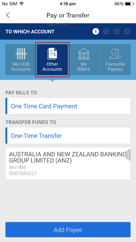
Current Application
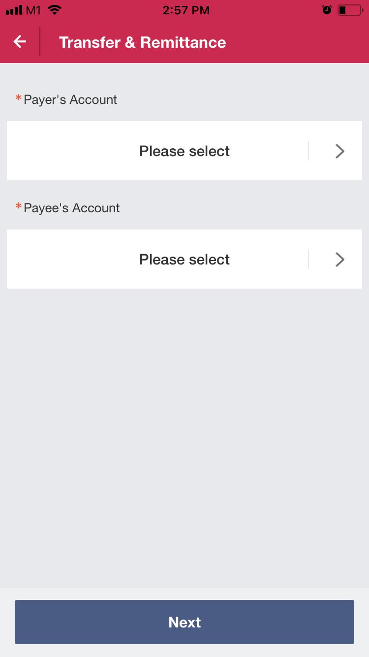
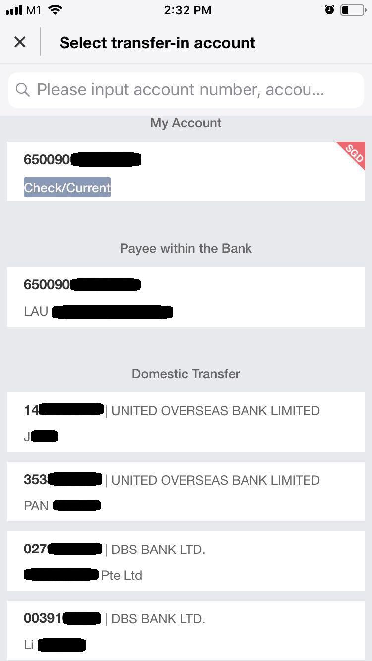
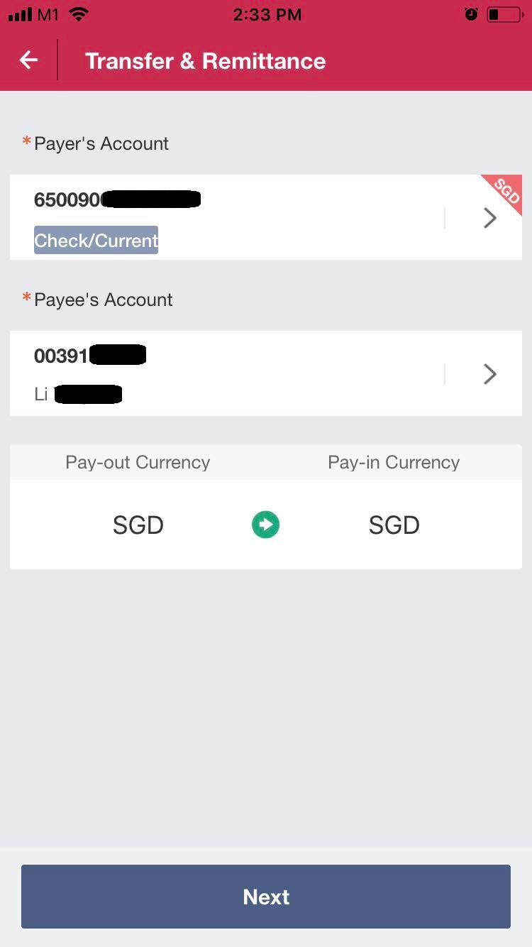
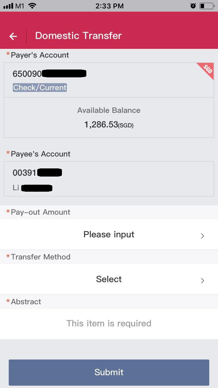
Current flow in BOC application for bank transfers
Images are provided by the organizers
Pain Point
Single Page, but user keeps being directed to a separate page to choose the account, before going back to the same page. The constant forward and back flow of the transaction process breaks the overall app flow.
Heuristics Violated
H-4 Consistency and standards
The colour theme is not uniform (eg uses red for header, blue for buttons and tags and suddenly uses a small green arrow for conversion). Also, in the main page, the two headings are “Payer’s Account” and “Payee’s Account”, but at the page where user is asked to choose “Payee’s Account”, the header shows “Select transfer-in account” rather than “Select Payee’s Account”. This can potentially confuse the user due to mismatch in the titles.
H-5 Error Prevention
Not only that there are many similar words, such as ‘payer’ and ‘payee’, ‘pay-out’ and ‘pay-in’, they are also placed in close proximity, either top and bottom or side by side in the current interface. This increases the chances of errors as users can misread the texts easily, especially when they are no other visual cues.
Other Similar Applications
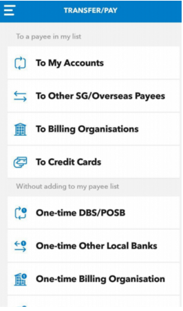
DBS (left), UOB (right)
Reduces memory load with good usage of icons. However, users may be overwhelmed by the large number of choices for different transfer methods.
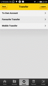
Maybank
Minimalist design but the size of the buttons are quite small and congregated at the top of the screen.
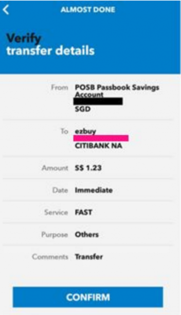
DBS Confirmation Page
Confirmation page for user verification reduces risks of errors.
Ideation
After looking at the current design of the app and other similar apps, my group decided on the following points:
One direction flow with minimal buttons on each page
Compiles to Neilson’s Heuristics H-8 (Aesthetic and minimalist design)
- To reduce cognitive load on users
- Rather than following the 3-click rule and causing users to be overwhelmed by the number of choices, each click is made easy by extracting out any extraneous information and provide progressive levels of detail along the way
- Fat finger rule is also followed, where large buttons are used, making it easy to navigate around for all users
%20Page.png)
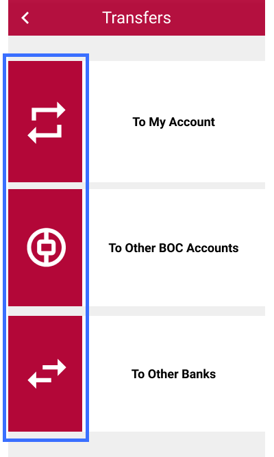
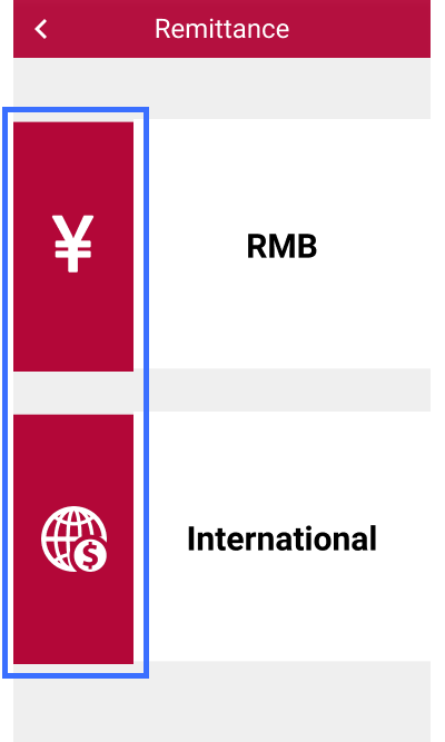
Usage of Icons
Compiles to Neilson’s Heuristics H-6 (Recognition rather than recall)
- Increase visualisation by using icons that users are familiar with
- Facilitate them in carrying out their tasks
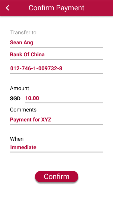
Confirmation page after submitting certain details
Compiles to Neilson’s Heuristics H-5 (Error prevention)
- Reduce errors by asking user to double check the information they had just keyed in
Follow a consistent app theme
Compiles to Neilson’s Heuristics H-4 (Consistency and standard)
- Red theme was chosen as it is the colour scheme for BOC
- Button layouts and transfer flow for different types of transfers were also kept consistent to provide familiarity for users
Design
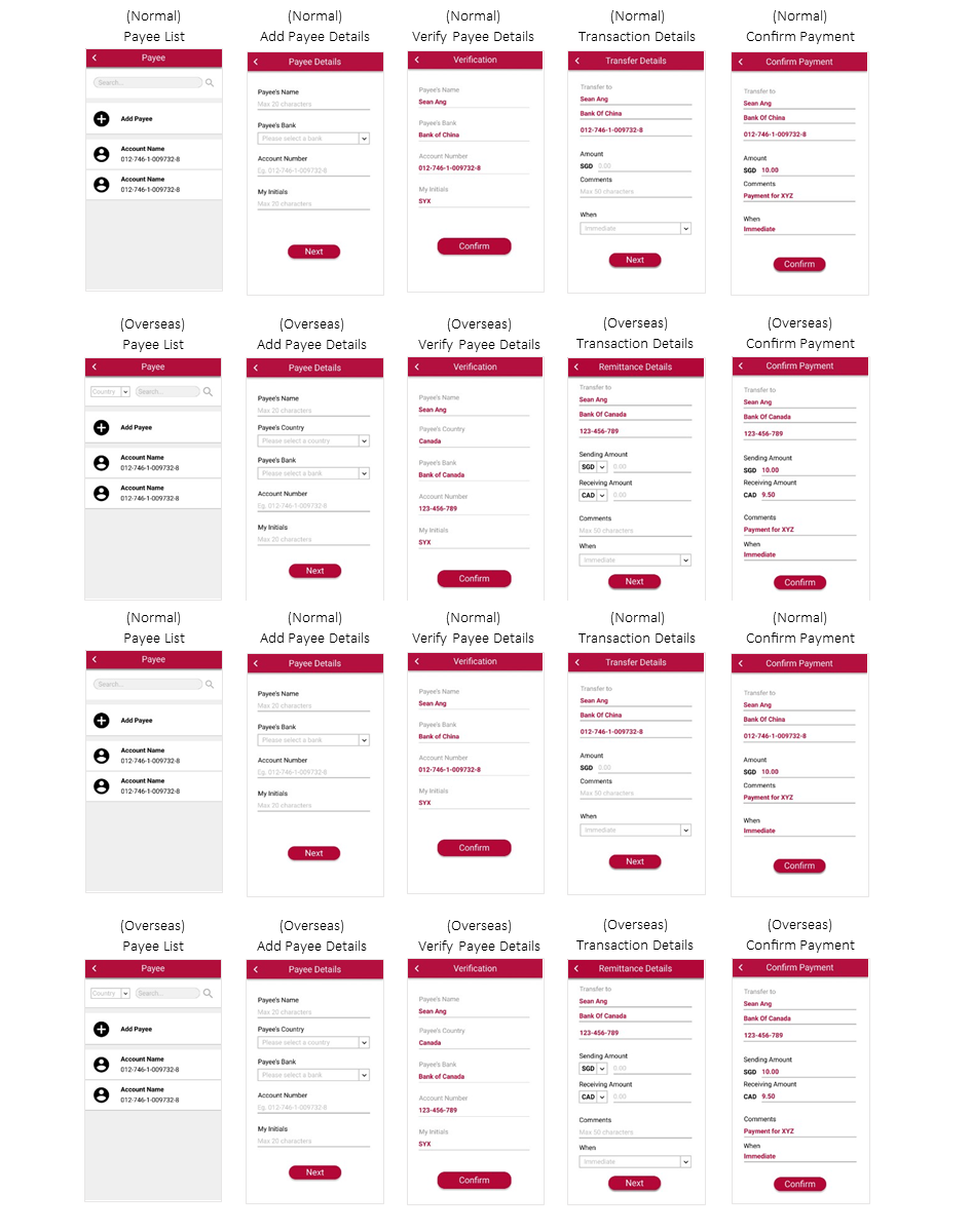
User Flow
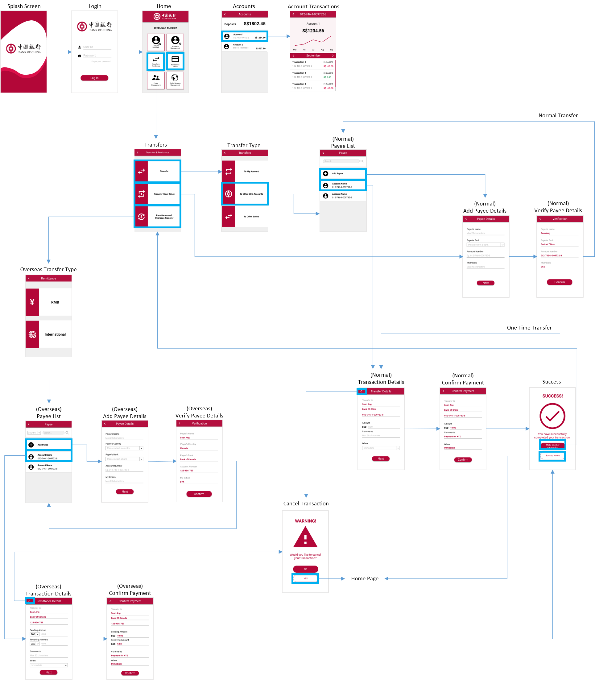
Prototype
Possible Enhancements
Due to time constraint, only the main transaction flow was demonstrated. After presentation to the judges, some feedbacks for improvements include:
- Incorporating a two-factor authentication system to increase security
- Adding a ‘Favourites’ list for actions that are commonly used by the user
- Including a ‘Home’ button for users to navigate back easily to the home page
These features will definitely be taken into consideration if more time was permitted.