VIMU
CS3240 Interaction Design Project
5 Sep 2018 – 13 Nov 2018
Introduction
VIMU (VIsual MUsic) is a web application that not only simplifies the process of music mixing, but also allows customization of music visuals in a fun and enjoyable way. It allows easy mapping of local audio to keys on the computer keyboard and you will be able to create your own unique musical piece by simply tapping on the keys.
This project is done in a group of 4 members, as part of CS3240 module.
Problem
While learning to compose electronic music may be an exciting idea, the steep learning curve and heavy investments into buying controllers, such as launchpad, may deter many from getting started in this niche field. My team notice this gap and want to create a platform for aspiring musicians to have a taste of how it is like to be in this field, by allowing them to play around with music composition in a fun and engaging way, such that they can make a better decision whether electronic music is for them.
Tools
Figma | InVision | HTML | CSS | Bootstrap | jQuery
Empathize
User Study
To better understand the needs and frequently used features by electronic musicians, my team decided to conduct contextual inquiries with Electronic Music Lab (EML) members from National University of Singapore (NUS), who create and perform original electronic music live at various events.
We went down to one of their Ableton Live basic workshop held on 15 September 2018 and conducted contextual inquiries with their current and new members. As we talked to them, we also asked them to do a think-aloud and demonstrate how they use the features in Ableton Live. After they finished the tasks, we also asked them the problems they face when creating/performing music. Below are some interesting findings:
- Ableton Live is a complex application and the time taken to learn varies greatly (from 20 hours to a few months).
- When users first start using Ableton Live, they do not know where to start as there are too many functions. Even up till now, most of them do not know all the functions and uses only around 60% of the features available.
- During performance, there is limited engagement as audience only sees a musician on stage playing with a controller/laptop, at most with some stage lighting and tilting the controllers towards the audience such that they can see the lightings on the controllers.
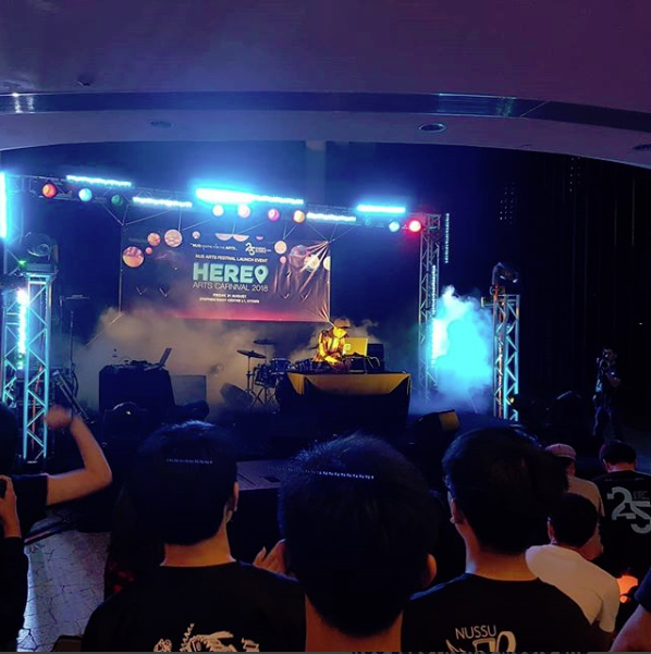
Performance by NUS EML
Key Features Used
- Quantization (allows music to be played on the beat or a fraction of the beat)
- Looping
- Toggling between on/off music on key press or hold key to play music
- Sound level display
- Mappign of audio to keys/controllers
- Importing music
- Sound library
- Recording/exporting of music
Pain Points
- Cannot immediately identify easily if an audio has been mapped to a key
- Cannot immediately identify the settings of an audio, eg looping, quantization
- Difficult to find music in the sound library
Current Applications
Besides conducting user studies, we also looked into current available applications for music mixing. From our research, applications in the market belong to two extreme fields. One extreme involves many advanced and complex tools that allows musicians to compose and mix music very precisely on the application (usually paid), while the other extreme is too simple and does not allow much customization (usually free).
Complex Application
Ableton Live (used by NUS EML) is an advanced software music sequencer and digital audio workstation for professionals to compose and perform music live. It consists of many features and effects that allows musicians to create fine adjustments to music and also supports mapping of music to keyboard or external controllers.
Although it can be a great application, the cheapest intro version costs USD 99 while the complete integrated version costs USD 749. Besides the cost, due to the wide variety of features available in the application, even with video tutorials, it will take some time for a beginner to get the hang of it.
Simple Application
Patatap and Mikutap are examples of web applications that allows users to get started with music mixing easily by simply tapping on keyboard keys.
Patatap (left), Mikutap (right)
Both uses visualizations, together with preloaded music, to create a fun experience for all users, regardless of their musical abilities. However, they are limited in scalability as both music and visualizations are preloaded and cannot be customized to users’ needs.
Define
Target Audience
After researching into the current applications and findings from the user studies, my team decided to come up with an intermediate-level platform, which combines the key ideas of the applications. To prevent users from being overloaded with too many features, key features in Ableton Live will be extracted out to let users have a taste of it. Yet, we would like to retain the fun element in music composition by keeping the idea of music visualizations in Patatap and Mikutap but allowing more flexibility by letting users map their own audio and customize the type of visuals shown.
Our main target audience will be for aspiring musicians who would like to try electronic music composition but are unsure if it is their field and do not want to dive too deep into actual electronic music composition yet. VIMU will be a good platform for them to get started as it allows them to try out key features in music mixing in a fun and enjoyable way.
Our secondary target audience will be the performers who would like to create better engagement with their audience through displaying interesting visualizations when they perform. VIMU allows customization in terms of mapping of audio to keyboard keys and type of visualizations shown (including colour and shapes). This new form of interaction with the audience can potentially make live performances more captivating.
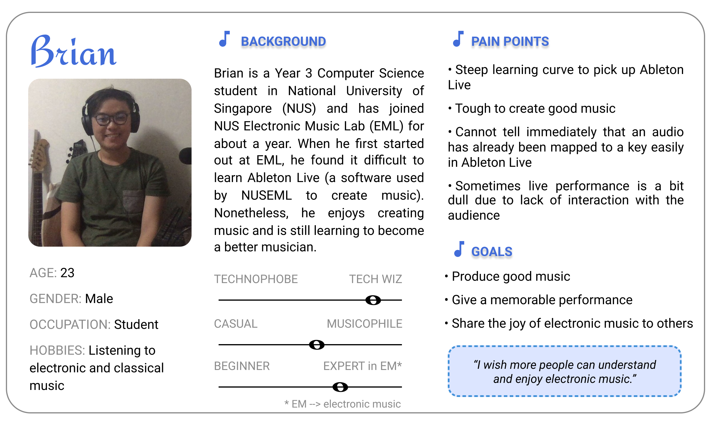
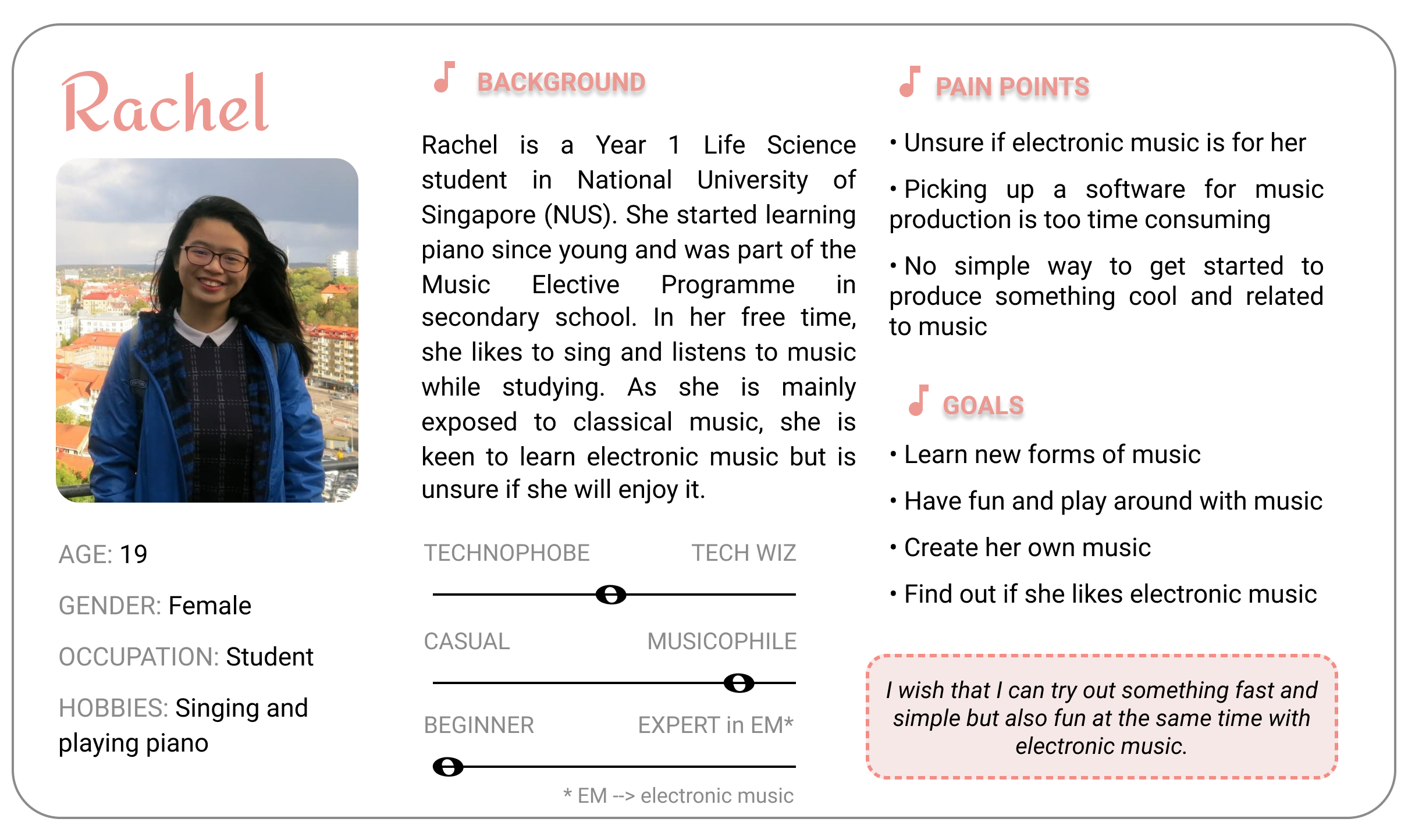
Persona
Following are the personas I have created for our two target audience after discussion with my team:
Ideation
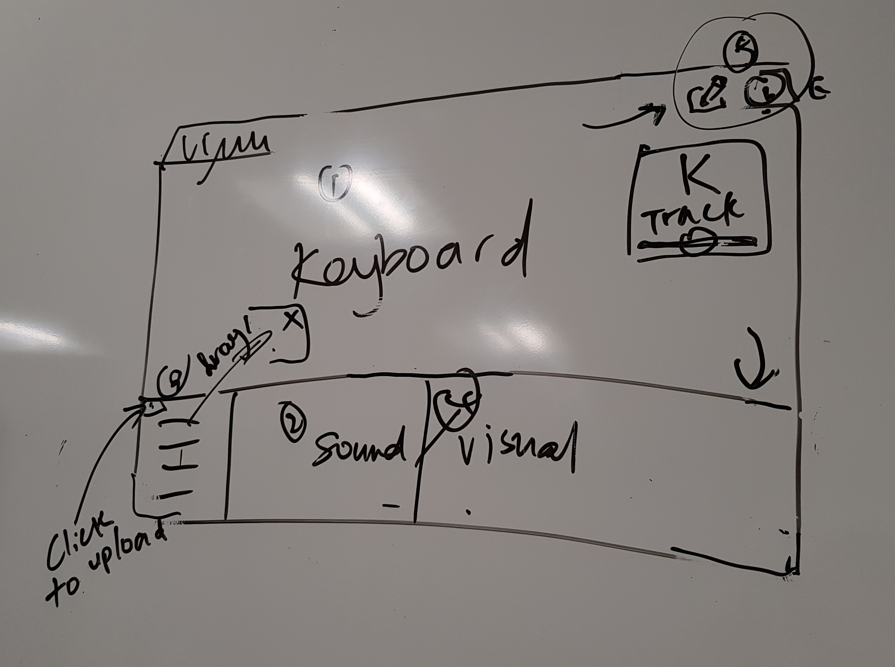
Prototype (Iteration 1)
My team followed parallel prototyping and decided to allow every member to have the freedom to design their own layouts and incorporate the features they deem necessary for the application for the first prototype.
For my first prototype, I decided to incorporate almost all the features listed by the users, while ensuring that these features are made obvious and simple for users to understand.
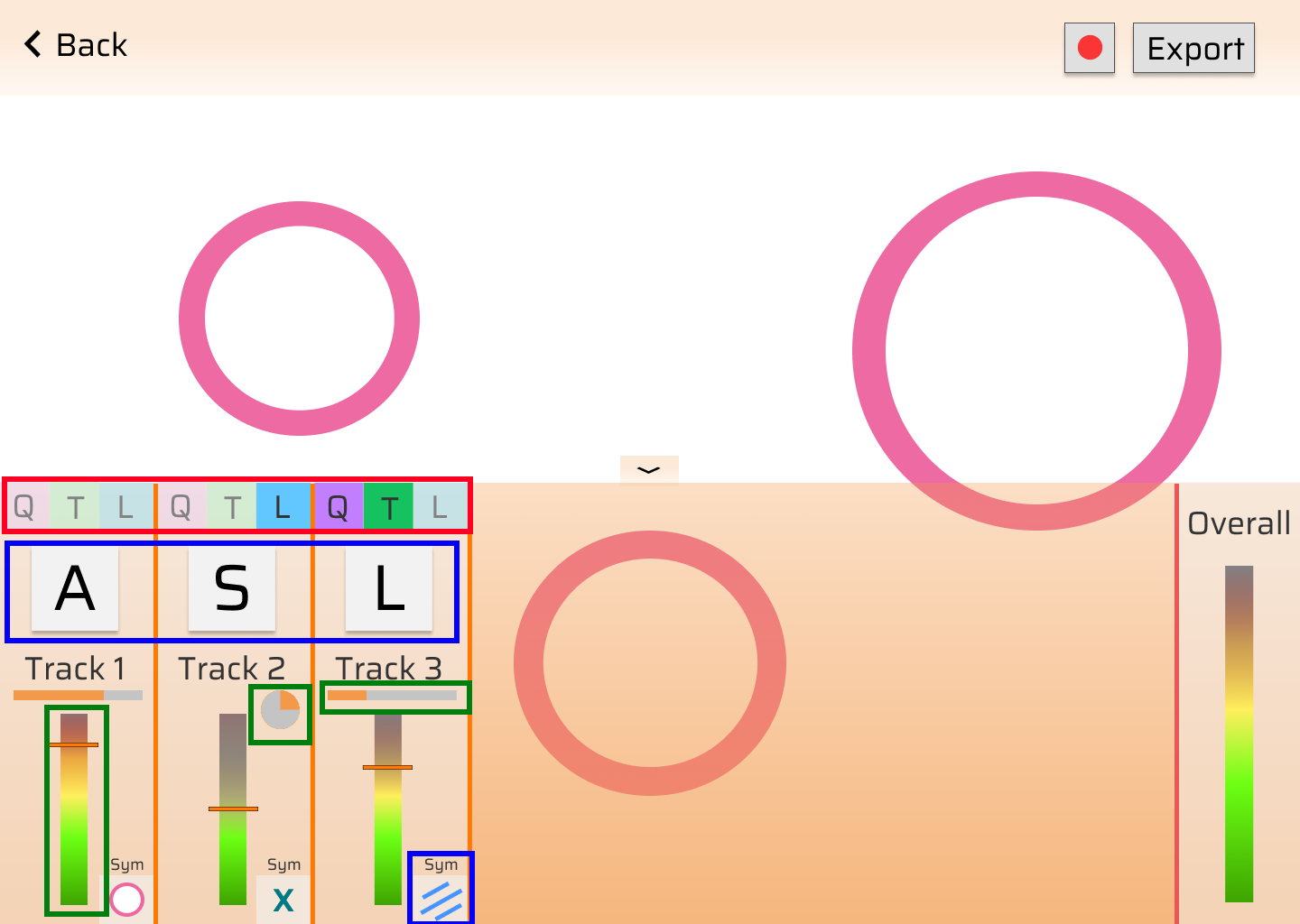
Performance Mode
Music Settings (Red Box)
Compiles to Neilson’s Heuristics H-7 (Flexibility and efficiency of use)
- The 3 buttons can be toggled and they represent the 3 main music settings (Quantization, Trigger, Loop).
- This allows musicians to toggle the settings easily during the performance.
Mappings (Blue Box)
Compiles to Neilson’s Heuristics H-6 (Recognition rather than recall)
- As one of the pain points was that users can easily identify if an audio has been mapped to a key, I have decided to make it more obvious by enlarging the key mapping information.
- Visualization mapping is also shown so that musicians need not remember the mappings and can focus on the performance.
Volume and Track indication (Green Box)
Compiles to Neilson’s Heuristics H-2 (Math between system and real world)
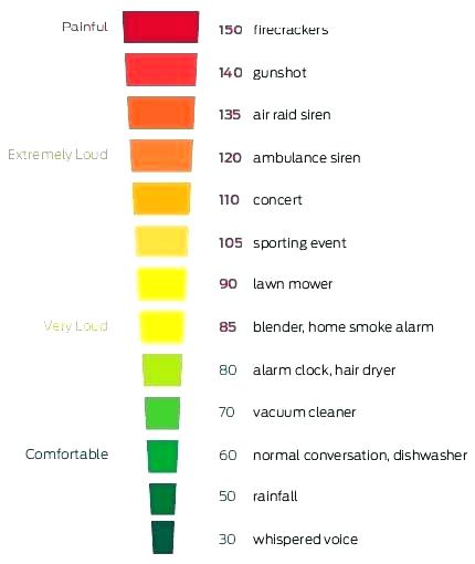
- The sound level display is designed after the noise level chart, where red indicates high in decibels and green indicates low in decibels.
- Indication of track progression is shown as a progress bar if the track is not on loop, and as a circular progress bar if the track is on loop. This makes it easier for musicians to know the settings of the track as looping is usually associated with circles.
Noise Level Chart
Visualization Customization
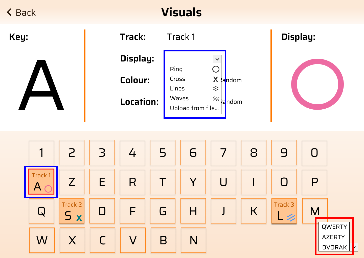
Keyboard Settings (Red Box)
Compiles to Neilson’s Heuristics H-6 (Recognition rather than recall)
- I added the option to choose between keyboard types as I would like to cater the application for types of keyboard as it will be easier for them to map the keys when the keyboard is in the correct layout
Visualizations (Blue Box)
Compiles to Neilson’s Heuristics H-6 (Recognition rather than recall)
- The visualization display is shown in the dropdown and on the keys itself to reduce cognitive load on users to recall the shapes.
- The selected key is also highlighted in red for better indication.
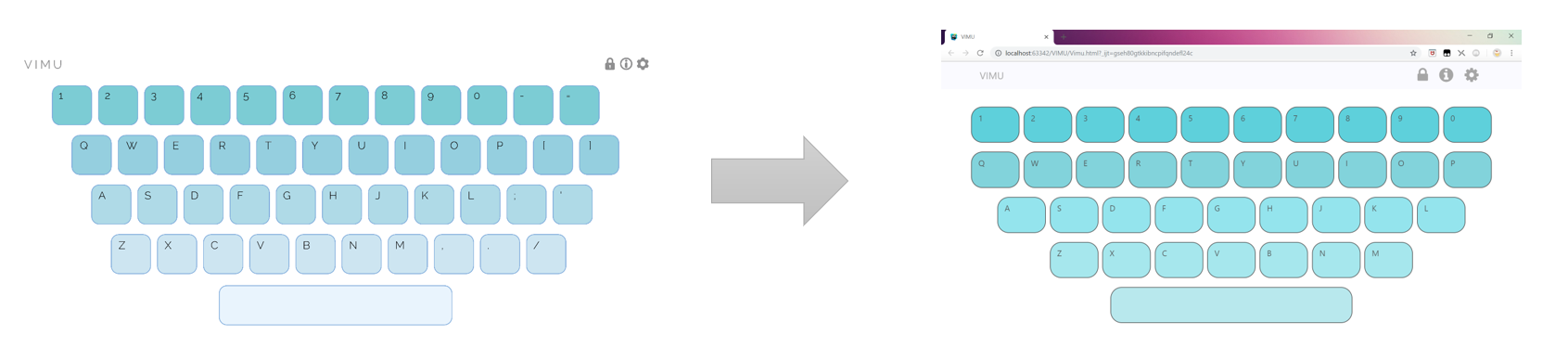
Interactive Prototype (Iteration 1)
Review for Prototype (Iteration 1)
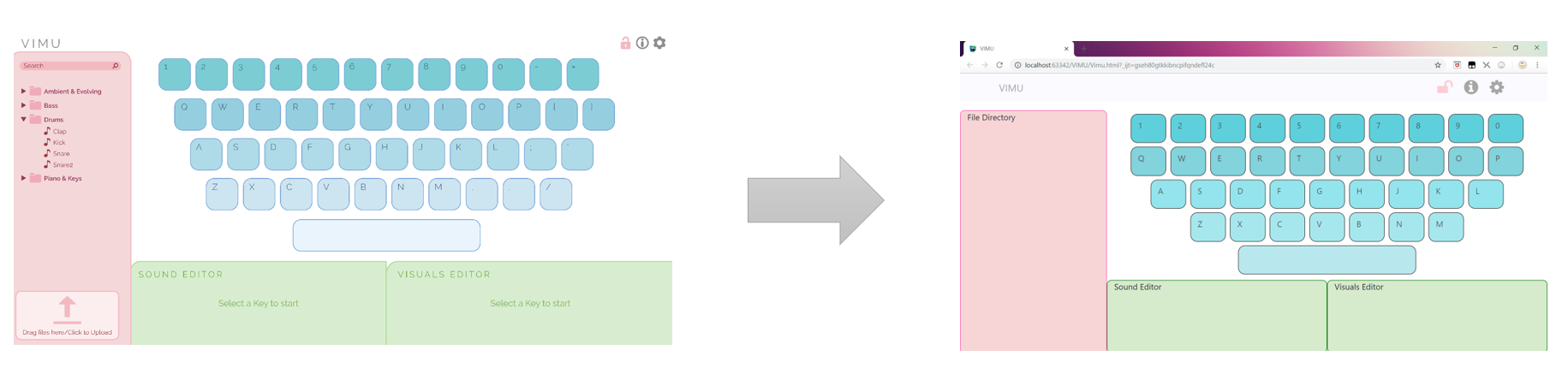
After reviewing all the prototype designs, we decided to adopt a minimalist design and make VIMU a single page application (Yee Ru’s layout design) to reduce the number of screens such that the UI is simple and easy to navigate. As the main focus of the application is on the keyboard and visuals, we decided to make the keyboard occupy the most space as the keys contain information like track name and track progression. This is similar to my design for visualization and audio mapping, where the keyboard occupies half of the screen and the editing area occupying the other half. However, my idea of supporting different types of keyboards was scraped as we decided to focus on the most common keyboard design (QWERTY) for our final prototype. Also, after much discussion, we chose to remove the record/export feature as we felt that it belongs to a good-to-have feature but not essential to our main application. Sound wave display was also decided to be added in as it is the only way to visualize the sound in the application.
Below is the layout of the design we have agreed on after the discussion:
Prototype (Iteration 2)
With the layout established, each of us again created a second prototype to decide on the overall design and feel of the application. I decided to stick to my original prototype colour scheme – orange, as it is a gender-neutral colour and I felt that it will appeal to both genders. Following Neilson’s Heuristics H-4 (Consistency and standards), standard icons are also used to indicate hiding of keyboard, editing mode and information.
Interactive Prototype (Iteration 2)
Review for Prototype (Iteration 2)
For this round’s prototype, we took a vote on the design and colour scheme and we all chose my teammate -- Marlene’s design. For her design, users are able to choose between a few colour schemes and the rounded edged buttons gives a better feel and look to the keyboard.
For the editing mode, Yee Ru’s design to enclose the track name in a box and colour it, creates a better understanding that the track is draggable from a key to another.
Yee Ru's Draggable Design
With that, we began to work on our final interactive prototype.
Prototype
Final Prototype
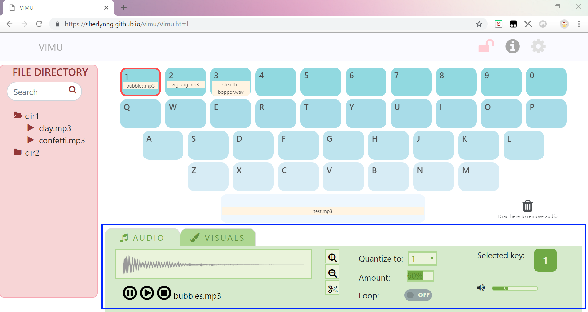
For our final prototype, I created the overall layout for the application on HTML (using Bootstrap and jQuery) to facilitate further collaboration. Besides the overall layout, I am also responsible for the keyboard design.
Following is a comparison between my teammate – Marlene’s prototype (left) and the HTML layout I have created (right):
Performance Mode
Edit Mode
However, as we worked on the project, we realized that the space allocated to sound and visuals customization was not sufficient. Hence, we decided to switch to tabbing between the two editing modes instead. The image below shows the changes made (blue box):
Go to VIMU